One of the most powerful parts of Cognos Insight is the ability to add different themes to your workspace. This can cause your widgets to pop out a little more, and give a little more color. Sometimes we want a little bit more than what we are given in the built-in themes. At this point Insight only has a few themes. All they give you is a background and a new color scheme.
I will be showing you how to make a theme that fits your needs and the needs of your business. I will be showing how to use basic themes, backgrounds, and buttons. The place where I like to start is with your own personal logo.
For demonstration purposes, I will be using the Datamensional logo.
We can see that our colors are blue and orange. For that reason, I should use a theme that is similar. Feel free to test out other themes but try not to use too many colors. We don’t want to distract the users. The purpose is to keep our attention on the charts and the valuable information that they contain.
The Default Theme
From the very start, we have the option of creating charts. This is a powerful tool right out of the box, but there is much more functionality and design that we can add. We can make these widgets give us a little more information as well as be more pleasing to the eyes. Here is a screen shot of a couple of widgets I made from some of our data.
Just by making a few minor tweaks we can have these charts provide us with more information and have a more uniform look between tabs.
The Built-In Theme
Using a built-in theme is the simple way to start. After opening Cognos Insight, near the bottom you can choose a theme, or click the style menu.
It’s usually wise to choose a color scheme that will match your logo, if you have one. For Datamensional the best choice would be Luminance, since the color schemes match. You are now on your way to a making a basic theme.
Basics on Widgets
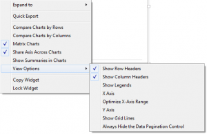
Sometimes it is nice to add borders to your widgets so they don’t seem like they are floating in space. To do this, click the widget menu bar and select “Show widget borders”. If you double click on an open area you can also write text for your widget titles. Right clicking on a widget will bring up the widget options as shown below.
I have unchecked some of the Axis to keep some confidentiality on our numbers. It is typically best to have a legend and have X axis and Y axis selected. I have selected Show Grid Lines, this will help us determine values easier.
Lastly, to add a logo, just drag and drop the logo file directly onto your workspace. With all of these add-ons this is now what our workspace looks like.
Themes for Advanced Users
This method is best for someone who is skilled with XML. I will not go into full detail but I will tell you where to find a file to edit. First navigate to:
C:UsersUserNameAppDataRoamingIBMCognos Insightconfigurationconfig_10.2.2254.0org.eclipse.osgibundles671.cpmodelthemes
Next, choose a theme and unzip it. It would be best to copy the files and rename them. From there feel free to plug away and change what you need from various fonts to styles.
When creating a background we should make it 1152 x 864. That’s the maximum space that we can use for a screen shot when using the print to PDF feature. To create backgrounds you can use a free tool called GIMP. GIMP can be downloaded at http://www.gimp.org. And, there you have it. Enjoy! Be sure to tell us what you think!


